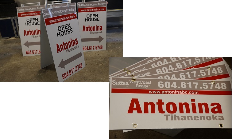
Realtor For Sale signs – advertising real estate for sale. These designs are made in most cases from inexpensive Coroplast. They are resistant to negative conditions and moisture. Often hung on racks. Frequently ordered items are 8 ″ H X 24 ″ W. Designs can also be vertical. The common size is 30 ″ H X 24 ″ W. In most cases, they have a two-way design – advertising information is on both sides of the design.
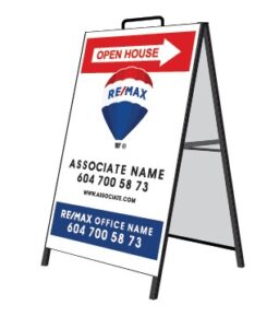
Open House signs real estate are a simple and effective advertising design. Signs are easy to fold and install in a convenient location. If necessary, the structure is also easy to remove. Information is contained on two front sides of the structure. These products can be of different sizes. The most common sizes are 18″ X 24 ″ and 24″ X 36 ″.
Real Estate A-Frame signs, unlike the above folding items, have a metal frame with legs. The sizes of such designs can be different, the most common are – 18 ″ X 24″ and 24″ X 36″.
Realtor Directional signs – advertising structures that indicate the direction, for example, to a house for sale. Coroplast is often used to make such products. This material is very durable. Designs made from it last a long time. The surface of the products may be coated for additional protection.
Real Estate For Sale Rider signs contain a minimum of information. This is a plate on which the telephone number and agent name are displayed, or it says “SOLD” or “For Sale”. Such a sign, with the right selection of color and font, draws attention to itself, which provides the desired effect – attracting the attention of potential customers. Common sizes: 24 “x 6”, 32” x 6”, as well as 36“ x 6”.
Vehicle Magnet Realtor signs are an effective means of advertising. This is a sign mounted on a car body. With its help, it is easy to attract the attention of all potential customers who see your car with real estate advertising.
Realtor Banner signs – an advertising product. As a rule, the surface of the banner contains only the most basic information, including contact details for communication with a realtor. Advertising banners may vary in size, and are made by full color printing.
Commercial Realtor signs – large advertising structures. They are distinguished by the maximum attention-grabbing of information that is placed on their surface, due to the large size of the structure itself. Such advertising objects are often installed at intersections where pedestrians and car drivers see them. The most common sizes are 48” x 48” and 48” x 72”.
Realtor sign design
The design of Real Estate Open House signs and other designs may be different. It all depends on your ideas of how the design you’re using should look. To make the image and graphics unique, as a rule, branded parts are used. Brand details include not only special graphics and images, but also the color scheme.
The style of Custom Estate signs is important to maintain in the corporate style. Moreover, all constructions that a particular agent uses must share a common design style. It is important to create advertising so that the business whose activity it promotes becomes recognizable. In their subconscious, people remember important features they’ve seen. If, at some earlier time, they had contacted the agents of a particular company, when they see the corporate design, they will immediately decide to use the information they saw.
To attract increased attention to signs for real estate, you can use additional tools. These include, for example, illumination. The best illumination uses LED technology. Features of different types of LED technology are different, but their main advantage is the light effect. Illumination works especially effectively in the evening. Potential customers are guaranteed to notice your ad. Accordingly, the effectiveness of your advertising will increase. This will lead to the development of your activities in the field of real estate services.
Important Features
The best Open House signs or other designs used in real estate advertising should take into account important points. Such points include the careful study of graphic information that potential customers will see. It is important to ensure the readability of letters and numbers. To achieve this, you need to choose a clear font and the optimal height and width of the letters and numbers. If the information on signs is difficult to read, then the design automatically becomes an ineffective advertising tool.
Choosing a font is a crucial step. It is important not only to choose an easily readable font, but also to keep in mind company details, as many companies use an individual font. It is necessary to apply information to the surface of signs so that it can be read both close-up and far away. It will greatly enhance the signs effectiveness if the information is easily readable by people in passing cars.
It is important to consider which information blocks that will be placed on the surface of Real Estate signage or other advertising structures. Many believe that there should be no empty spaces. But this opinion is, unfortunately, the wrong one. Empty spaces should be present in a certain amount, since empty spaces play an important role – they contribute to better readability of the information. If there is a too much information, it will be more difficult to read. Empty spaces contribute to a sense of lightness, an aesthetic perception. All these points positively affect the perception of advertising by potential customers.
Brevity of presentation is another important point. There’s no need to use a lot of text. While of course it’s necessary to state the most important information, it is recommended to prioritize – which information is more important and placed higher, and that which is less important placed lower.
We have already talked above about the color scheme. Once again, we want to note that the choice of color is important. The result of the perception of information contained on Home For Sale signs or other advertising structures depends on the result of the choice. The proper choice of color will help to distinguish you from competitors. At the same time, the wrong choice can worsen the effect of perception of advertising. Advertising money will be wasted. It is important to pay attention to the contrast of colors in advertising performance in combination with the corporate identity. The number of colors should not be large. To understand what colors are most suitable for the manufacture of your advertising, it is better to start your selection by first choosing the brightest color from the corporate color palette.

